Sandra Caravana
Copywriter
With the increase in internet access via mobile devices, it is imperative to make the user experience more dynamic, easy and intuitive. Responsive design creates layouts for different screens, ensuring pleasant aesthetics, easy interaction, excellent readability and intuitive navigation.
Responsive design is the ability to develop web pages whose elements adjust automatically and flawlessly to different screen sizes, constantly guaranteeing pleasant aesthetics, uncomplicated interaction, clear reading and natural navigation.
In other words: if your site isn’t adapted for mobile, the user will give up on the visit, purchase or interaction.
In the last quarter of 2023, mobile devices (excluding tablets) accounted for 58.6% of global website traffic. Since 2017, cell phones and smartphones have maintained a constant presence above 50%, surpassing that mark in 2020, according to available data.
The concept of responsive web design – RWD
Tim Berners Lee was responsible for creating the World Wide Web in 1989. Responsive Web Design, introduced by Ethan Marcotte in 2010, emerged to meet the demands of the new technologies of the 21st century, such as smartphones and tablets, adapting content to the user, thus being in the same line of thought (and work) as the concept of UX: the user’s perspective.
In times past, when creating a website, the choice was between a liquid design, which adjusted to the browser window, or a fixed-width design, with specific dimensions in pixels.
The liquid design caused compression on smaller screens and excessively long lines on larger screens. Meanwhile, the fixed-width design generated horizontal scroll bars on narrow screens and white space around the edges on wider screens.
You don’t need a degree in design to realize when a website isn’t responsive: you’ve probably come across a website that, when viewed on your smartphone, you have to scroll sideways to read the full sentence.

Responsive design in 3 techniques
Responsive design is not a separate technology, but an approach to web design using practices such as:
- Fluid grids: a layout system that uses percentage units to define the width of the grid’s columns and rows.
- Fluid images: setting the max-width property to 100% allows images to shrink to fit a narrower column while maintaining their intrinsic size, without enlarging.
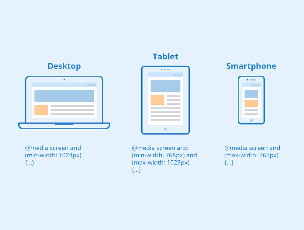
- Media Queries: instead of having a single layout for all screen sizes, you can change it. For example, sidebars can be repositioned on smaller screens, or an alternative navigation can be displayed, providing flexible adaptation to different viewing conditions.

Responsive Design VS Adaptive Design
It’s worth clarifying the difference in concepts before moving on to the reasons and benefits that responsive design can bring to your business or your digital marketing work, so that it’s clear that this web design and programming work is much more than adapting the site to screen sizes.
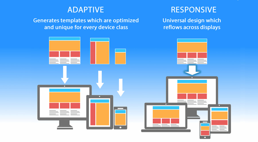
The difference between responsive and adaptive design lies in the fact that responsive design adjusts the rendering of a single page version, while adaptive design offers multiple, completely different versions of the same page.

Responsive design for Marketing
Responsiveness is the main keyword for engagement strategies.
Being responsive is no longer about being able to reply to a customer’s email in less than 24 hours. It’s now about the customer getting a response while visiting your business website.
Investing in responsive design, investing in responsive human resources, will result in faster conversions. It will have an impact on three fronts: technical, experience and objectives.
Technical: eliminates the need to create specific layouts for each type of computer, smartphone or tablet.
Experience: UX/UI Designer seeks to improve the user experience in every aspect. Responsive design ensures consistency and avoids frustration.
Objectives: As well as avoiding problems such as missing buttons in broken layouts, it reinforces the fundamental concept of balance between form and function, ensuring the success of the user experience on different devices.
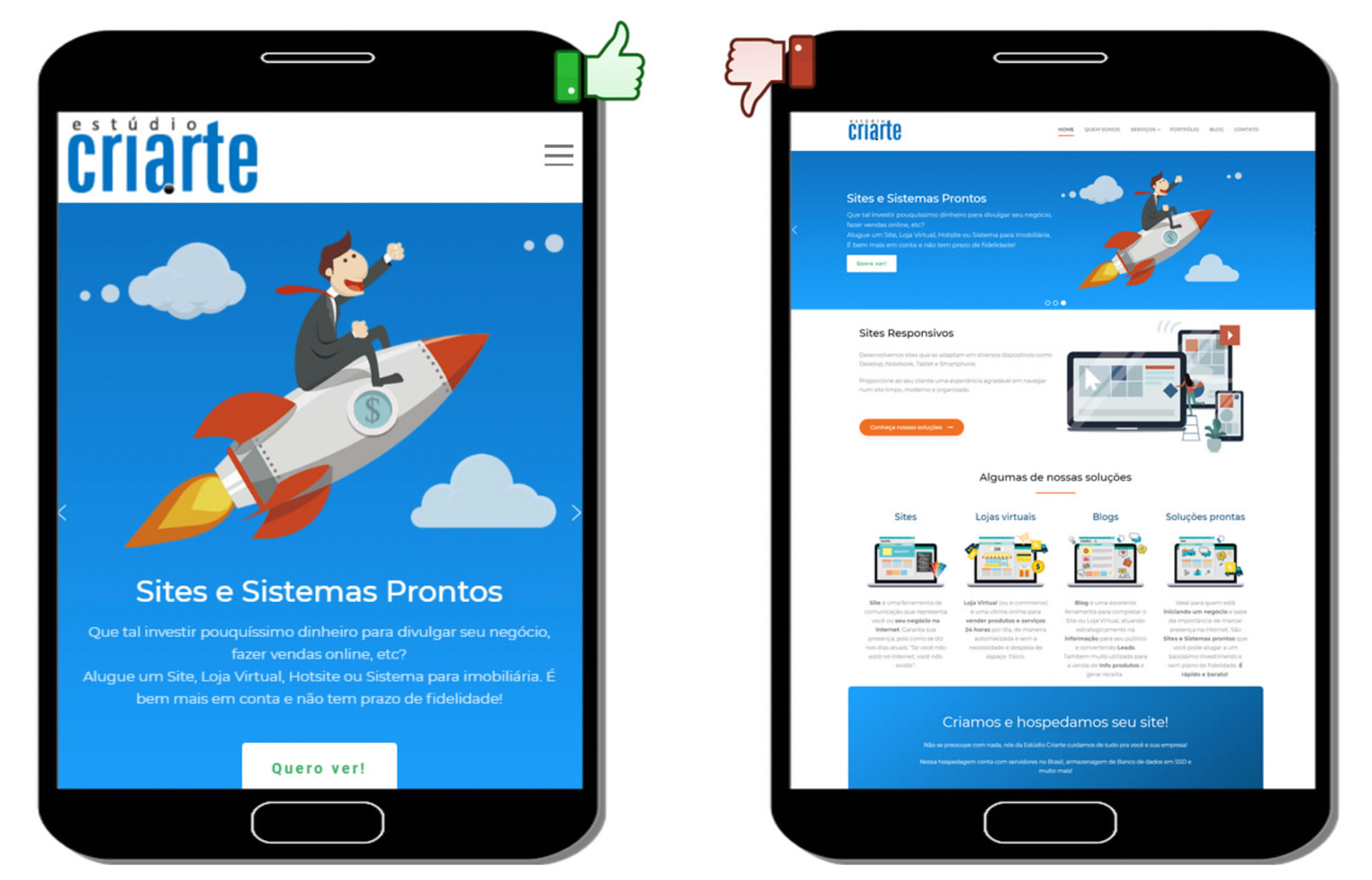
Responsive websites avoid
- the need to zoom in to read text on mobile devices;
- cluttered overlapping of elements on smaller screens;
- hiding buttons and CTA’s on different resolutions;
- loss of important information on smaller screens;
- misalignment of forms and input fields;
- creation of unnecessary scroll bars on smaller devices.

Source: Estúdio Criarte
Responsive design and SEO
Based on recent data showing the increase in mobile traffic to your site, it’s clear that even if you decide to start a site with a desktop version, you’ll need to invest in a mobile-friendly version and later – but not too late – a mobile-first version.
Since 2018, with Google’s adoption of the mobile-first principle, page loading speed has become crucial for SEO. Responsive design condenses pages for faster loading, especially on smaller screens, avoiding user frustration.
SEO agencies recommend responsive design to reduce bounce rates and improve search engine rankings: responsive design makes it easier to deliver content in an organized and clear way.
The ability to easily view and navigate content on any device is essential for creating good first impressions.
With the increase in the volume of internet access via mobile devices, the number of online purchases made via these devices is also following the same upward trend.
A responsive website creates more interaction, providing digital word-of-mouth, which is to say, more shares on social networks.
Responsive design and copywriting
If images have to be optimized, so do words.
Labels and placeholders are strategic decisions.
Labels tell users what information should be in a particular form field and are usually positioned outside of it. A placeholder, located within a form field, is a suggestion, description or example of the information required for a particular field. Good UX practice dictates that the placeholder disappears when the user types in the field.
The decision whether or not to write a placeholder will also depend on the persona of your business: how digitally literate is your persona?
Current best practices suggest replacing the placeholder with a more explanatory label.

Benefits of responsive design
- A responsive website provides easy access on any device, without the need to zoom or scroll horizontally.
- Google recommends responsive sites because a single site with the same URL makes it easier to crawl and index.
- Users easily find what they’re looking for, increasing engagement and potentially generating more sales or leads.
- Managing a single responsive site saves time and resources
- A responsive website conveys a more professional and up-to-date brand image.
- Responsive design facilitates the implementation of marketing strategies, allowing detailed analysis of user behavior on various devices, enhancing the overall marketing strategy.
